PixelLayer UI
Pure CSS UI framework designed for Shopify Dawn theme. Fully customizable via your Shopify app admin panel, with no JavaScript required. You can also use it with other Shopify themes or customize your current theme easily.
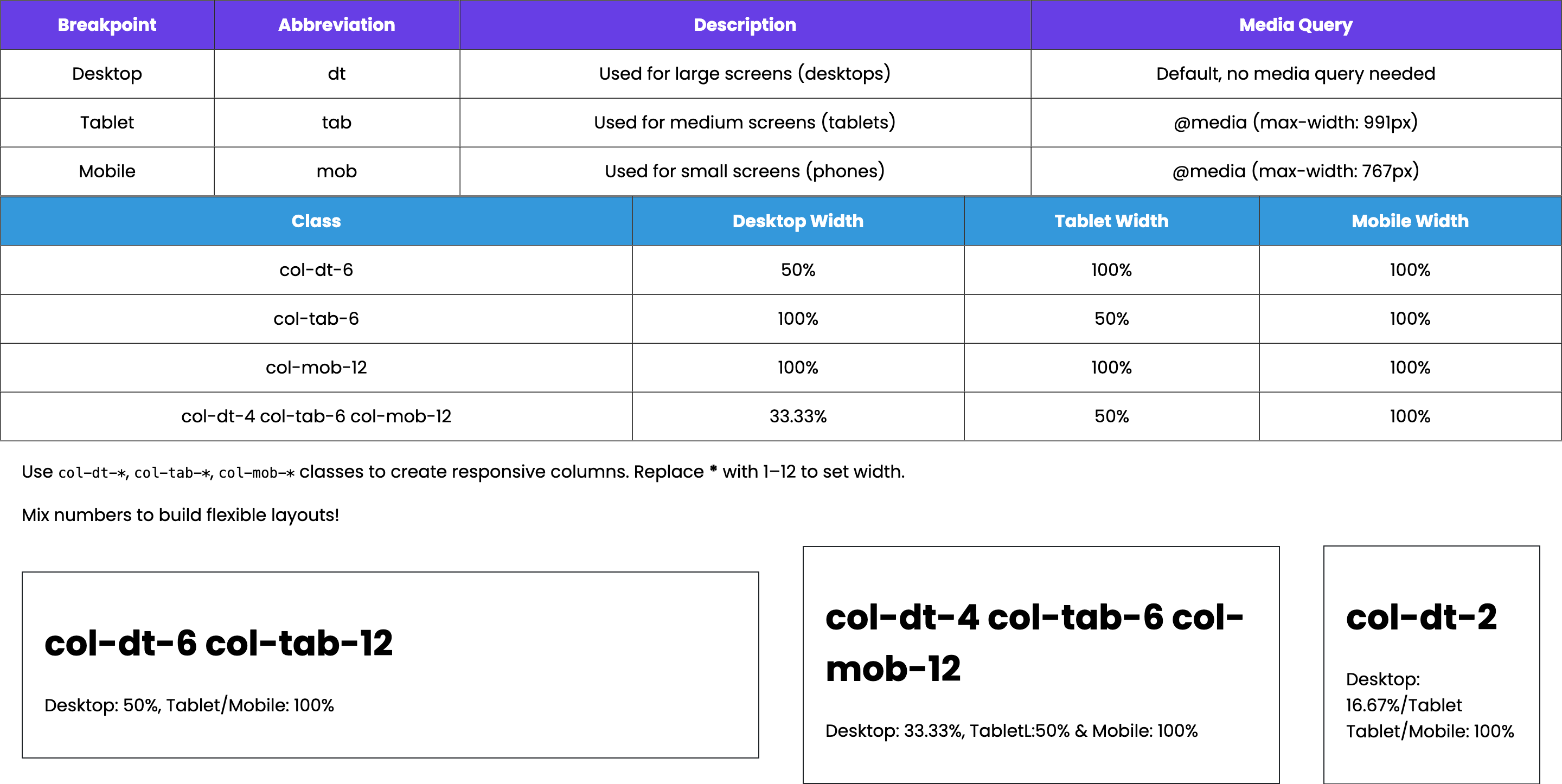
Grid Framework
This framework uses a 12-column responsive grid. You can define column widths for different devices using col-dt-*, col-tab-*, and col-mob-*. Replace * with a number from 1 to 12.
Background Color
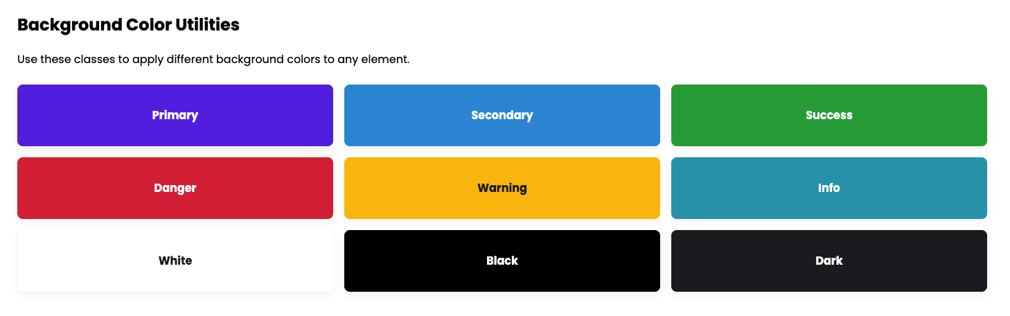
To apply a background color using your PixelLayer UI utility classes, simply add the corresponding class to any HTML element. For example, adding .bgc-primary will apply the primary brand color as the element’s background. These utility classes are predefined, reusable, and fully customizable via your Shopify app admin panel. You don’t need to write any extra CSS—just use the class on buttons, cards, sections, or any other elements. This approach makes your design scalable, consistent, and easy to maintain across your store.
Tip: In .bgc-primary, bg means background, c means color, and primary refers to the primary color code defined in your SCSS variables.
| Class | Description | Example |
|---|---|---|
.bgc-primary |
Primary brand color | <div class="bgc-primary">Primary</div> |
.bgc-secondary |
Secondary color | <div class="bgc-secondary">Secondary</div> |
.bgc-success |
Success green | <div class="bgc-success">Success</div> |
.bgc-danger |
Danger red | <div class="bgc-danger">Danger</div> |
.bgc-warning |
Warning yellow | <div class="bgc-warning">Warning</div> |
.bgc-info |
Info blue | <div class="bgc-info">Info</div> |
.bgc-white |
White background | <div class="bgc-white">White</div> |
.bgc-black |
Black background | <div class="bgc-black">Black</div> |
.bgc-dark |
Dark gray background | <div class="bgc-dark">Dark</div> |
Text Color
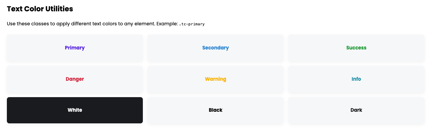
To apply a text color using your PixelLayer UI utility classes, simply add the corresponding class to any HTML element. For example, adding .tc-primary will apply the primary brand color to the element’s text. These utility classes are predefined, reusable, and fully customizable via your Shopify app admin panel. You don’t need to write any extra CSS—just use the class on headings, paragraphs, buttons, or any other text elements. This approach makes your design scalable, consistent, and easy to maintain across your store.
Tip: In .tc-primary, tc means text color, and primary refers to the primary color code defined in your SCSS variables.
| Class | Description | Example |
|---|---|---|
.tc-primary |
Primary brand color | <p class="tc-primary">Primary Text</p> |
.tc-secondary |
Secondary color | <p class="tc-secondary">Secondary Text</p> |
.tc-success |
Success green | <p class="tc-success">Success Text</p> |
.tc-danger |
Danger red | <p class="tc-danger">Danger Text</p> |
.tc-warning |
Warning yellow | <p class="tc-warning">Warning Text</p> |
.tc-info |
Info blue | <p class="tc-info">Info Text</p> |
.tc-white |
White text | <p class="tc-white">White Text</p> |
.tc-black |
Black text | <p class="tc-black">Black Text</p> |
.tc-dark |
Dark gray text | <p class="tc-dark">Dark Text</p> |
Border
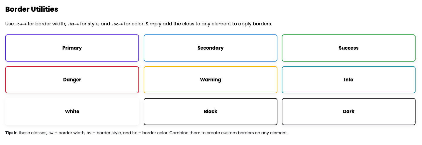
1. Border Width Utilities (.bw-*)
Explanation (General):
To apply a border width using your PixelLayer UI utility classes, simply add the corresponding .bw-* class to any element. For example, .bw-2 applies a 2px border. These classes are predefined and reusable.
Tip: bw = border width, the number indicates the pixel size.
| Class | Description | Example |
|---|---|---|
.bw-0 |
No border | <div class="bw-0">No Border</div> |
.bw-1 |
1px border | <div class="bw-1">1px Border</div> |
.bw-2 |
2px border | <div class="bw-2">2px Border</div> |
.bw-3 |
3px border | <div class="bw-3">3px Border</div> |
.bw-4 |
4px border | <div class="bw-4">4px Border</div> |
.bw-5 |
5px border | <div class="bw-5">5px Border</div> |
2. Border Style Utilities (.bs-*)
Explanation (General):
Use .bs-* classes to define the border style of an element. For example, .bs-dashed will make the border dashed. These are reusable and easy to maintain.
Tip: bs = border style.
| Class | Description | Example |
|---|---|---|
.bs-solid |
Solid border | <div class="bw-2 bs-solid">Solid Border</div> |
.bs-dashed |
Dashed border | <div class="bw-2 bs-dashed">Dashed Border</div> |
.bs-dotted |
Dotted border | <div class="bw-2 bs-dotted">Dotted Border</div> |
3. Border Color Utilities (.bc-*)
Explanation (General):
Apply border colors using .bc-* classes. For example, .bc-primary applies your primary SCSS color to the border. Combine with .bw-* and .bs-* for complete border control.
Tip: bc = border color, and the suffix matches the SCSS variable name.
| Class | Description | Example |
|---|---|---|
.bc-primary |
Primary brand color | <div class="bw-2 bs-solid bc-primary">Primary Color</div> |
.bc-secondary |
Secondary brand color | <div class="bw-2 bs-solid bc-secondary">Secondary Color</div> |
.bc-success |
Green success color | <div class="bw-2 bs-solid bc-success">Success Color</div> |
.bc-danger |
Red danger color | <div class="bw-2 bs-solid bc-danger">Danger Color</div> |
.bc-warning |
Yellow warning color | <div class="bw-2 bs-solid bc-warning">Warning Color</div> |
.bc-info |
Blue info color | <div class="bw-2 bs-solid bc-info">Info Color</div> |
.bc-white |
White border | <div class="bw-2 bs-solid bc-white">White Color</div> |
.bc-black |
Black border | <div class="bw-2 bs-solid bc-black">Black Color</div> |
.bc-dark |
Dark gray border | <div class="bw-2 bs-solid bc-dark">Dark Color</div> |
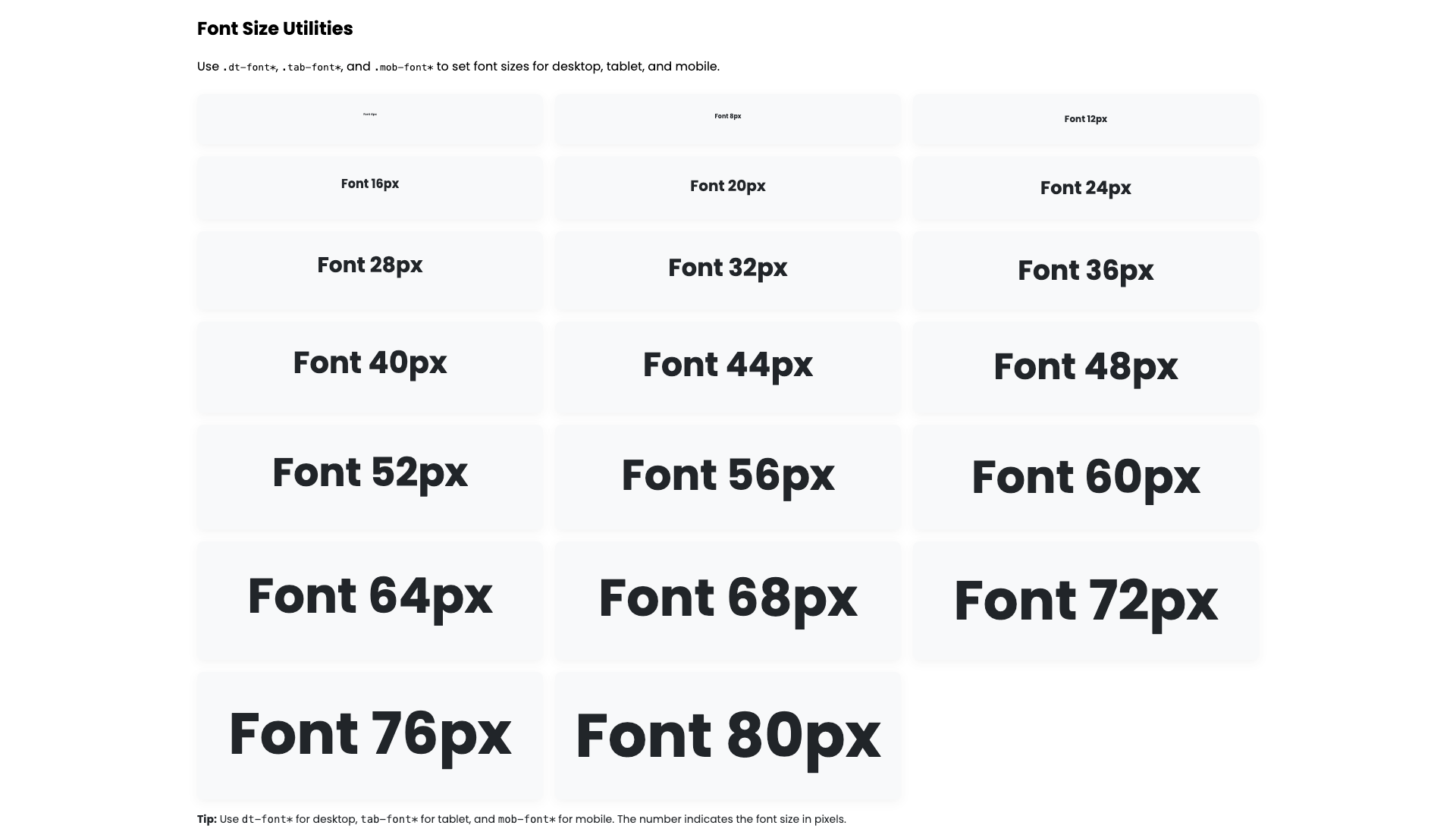
Font Size
PixelLayer UI allows you to set font sizes from 4px to 80px using utility classes. You can apply different sizes for desktop, tablet, and mobile. These classes are predefined and reusable. Just add the class to headings, paragraphs, buttons, or any text element—no extra CSS needed. This approach ensures your typography is scalable, consistent, and responsive across your store.
Tips:
-
dt-font*→ Desktop font size -
tab-font*→ Tablet font size -
mob-font*→ Mobile font size -
The number after the class represents the font size in pixels (e.g., 16 → 16px)
1. Desktop Font Sizes
| Class | Description | Example |
|---|---|---|
.dt-font4 |
4px font size | <p class="dt-font4">Text</p> |
.dt-font8 |
8px font size | <p class="dt-font8">Text</p> |
.dt-font12 |
12px font size | <p class="dt-font12">Text</p> |
.dt-font16 |
16px font size | <p class="dt-font16">Text</p> |
.dt-font20 |
20px font size | <p class="dt-font20">Text</p> |
.dt-font24 |
24px font size | <p class="dt-font24">Text</p> |
.dt-font28 |
28px font size | <p class="dt-font28">Text</p> |
.dt-font32 |
32px font size | <p class="dt-font32">Text</p> |
.dt-font36 |
36px font size | <p class="dt-font36">Text</p> |
.dt-font40 |
40px font size | <p class="dt-font40">Text</p> |
.dt-font44 |
44px font size | <p class="dt-font44">Text</p> |
.dt-font48 |
48px font size | <p class="dt-font48">Text</p> |
.dt-font52 |
52px font size | <p class="dt-font52">Text</p> |
.dt-font56 |
56px font size | <p class="dt-font56">Text</p> |
.dt-font60 |
60px font size | <p class="dt-font60">Text</p> |
.dt-font64 |
64px font size | <p class="dt-font64">Text</p> |
.dt-font68 |
68px font size | <p class="dt-font68">Text</p> |
.dt-font72 |
72px font size | <p class="dt-font72">Text</p> |
.dt-font76 |
76px font size | <p class="dt-font76">Text</p> |
.dt-font80 |
80px font size | <p class="dt-font80">Text</p> |
2. Tablet Font Sizes
| Class | Description | Example |
|---|---|---|
.tab-font4 |
4px font size | <p class="tab-font4">Text</p> |
.tab-font8 |
8px font size | <p class="tab-font8">Text</p> |
.tab-font12 |
12px font size | <p class="tab-font12">Text</p> |
.tab-font16 |
16px font size | <p class="tab-font16">Text</p> |
.tab-font20 |
20px font size | <p class="tab-font20">Text</p> |
.tab-font24 |
24px font size | <p class="tab-font24">Text</p> |
.tab-font28 |
28px font size | <p class="tab-font28">Text</p> |
.tab-font32 |
32px font size | <p class="tab-font32">Text</p> |
.tab-font36 |
36px font size | <p class="tab-font36">Text</p> |
.tab-font40 |
40px font size | <p class="tab-font40">Text</p> |
.tab-font44 |
44px font size | <p class="tab-font44">Text</p> |
.tab-font48 |
48px font size | <p class="tab-font48">Text</p> |
.tab-font52 |
52px font size | <p class="tab-font52">Text</p> |
.tab-font56 |
56px font size | <p class="tab-font56">Text</p> |
.tab-font60 |
60px font size | <p class="tab-font60">Text</p> |
.tab-font64 |
64px font size | <p class="tab-font64">Text</p> |
.tab-font68 |
68px font size | <p class="tab-font68">Text</p> |
.tab-font72 |
72px font size | <p class="tab-font72">Text</p> |
.tab-font76 |
76px font size | <p class="tab-font76">Text</p> |
.tab-font80 |
80px font size | <p class="tab-font80">Text</p> |
3. Mobile Font Sizes
| Class | Description | Example |
|---|---|---|
.mob-font4 |
4px font size | <p class="mob-font4">Text</p> |
.mob-font8 |
8px font size | <p class="mob-font8">Text</p> |
.mob-font12 |
12px font size | <p class="mob-font12">Text</p> |
.mob-font16 |
16px font size | <p class="mob-font16">Text</p> |
.mob-font20 |
20px font size | <p class="mob-font20">Text</p> |
.mob-font24 |
24px font size | <p class="mob-font24">Text</p> |
.mob-font28 |
28px font size | <p class="mob-font28">Text</p> |
.mob-font32 |
32px font size | <p class="mob-font32">Text</p> |
.mob-font36 |
36px font size | <p class="mob-font36">Text</p> |
.mob-font40 |
40px font size | <p class="mob-font40">Text</p> |
.mob-font44 |
44px font size | <p class="mob-font44">Text</p> |
.mob-font48 |
48px font size | <p class="mob-font48">Text</p> |
.mob-font52 |
52px font size | <p class="mob-font52">Text</p> |
.mob-font56 |
56px font size | <p class="mob-font56">Text</p> |
.mob-font60 |
60px font size | <p class="mob-font60">Text</p> |
.mob-font64 |
64px font size | <p class="mob-font64">Text</p> |
.mob-font68 |
68px font size | <p class="mob-font68">Text</p> |
.mob-font72 |
72px font size | <p class="mob-font72">Text</p> |
.mob-font76 |
76px font size | <p class="mob-font76">Text</p> |
.mob-font80 |
80px font size | <p class="mob-font80">Text</p> |
| Example Text | Class Applied | Result |
|---|---|---|
| Heading | .dt-font40 .tab-font32 .mob-font24 |
Responsive heading for all devices |
| Paragraph | .dt-font16 .tab-font14 .mob-font12 |
Body text with responsive sizing |
| Button Text | .dt-font20 .tab-font16 .mob-font14 |
Button text scales on tablet & mobile |
| Product Price | .dt-font24 .tab-font20 .mob-font16 |
Price label adapts for device |
| Call to Action | .dt-font32 .tab-font28 .mob-font20 |
Prominent CTA text across devices |
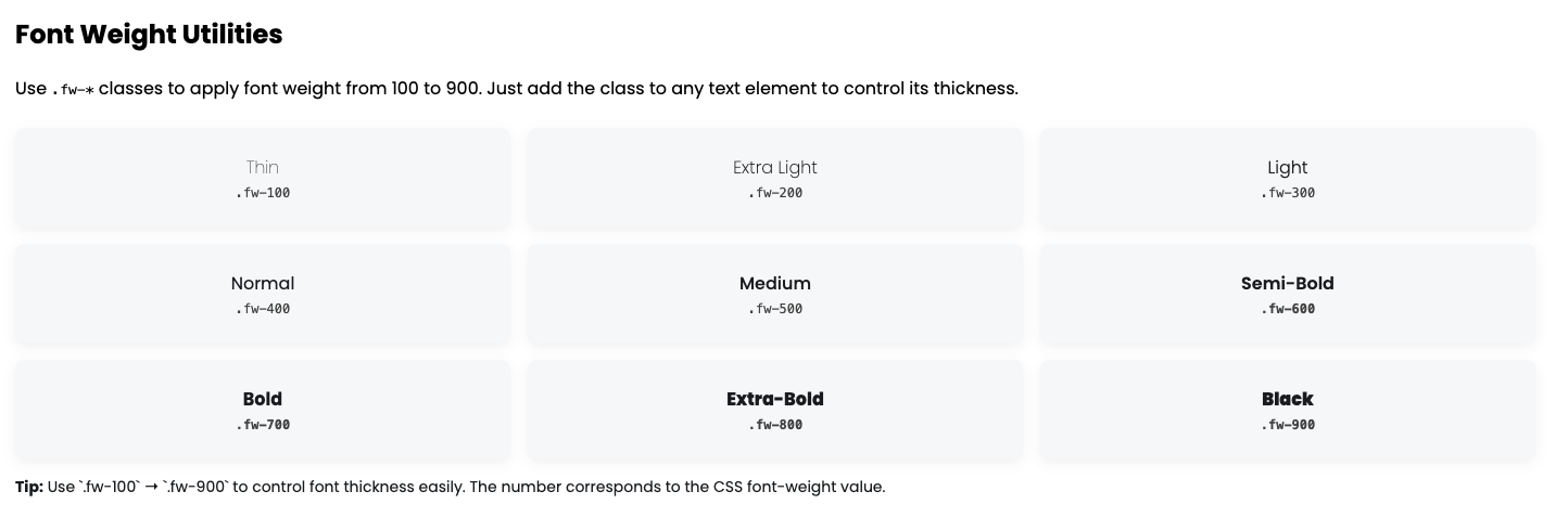
Font Weight
PixelLayer UI allows you to apply font weight easily using utility classes from 100 to 900. These classes are predefined and reusable. Simply add the class to any text element—headings, paragraphs, buttons, or labels—to control font thickness. This ensures your typography remains scalable, consistent, and visually appealing across your store.
Tips:
-
fw-*→ Font weight -
Number after
fw-(100 → 900) represents the weight value in CSS -
Use these classes to create thin, normal, bold, or extra-bold text easily
| Class | Description | Example |
|---|---|---|
.fw-100 |
Thin / Light | <p class="fw-100">Thin Text</p> |
.fw-200 |
Extra Light | <p class="fw-200">Extra Light Text</p> |
.fw-300 |
Light | <p class="fw-300">Light Text</p> |
.fw-400 |
Normal / Regular | <p class="fw-400">Normal Text</p> |
.fw-500 |
Medium | <p class="fw-500">Medium Text</p> |
.fw-600 |
Semi-Bold | <p class="fw-600">Semi-Bold Text</p> |
.fw-700 |
Bold | <p class="fw-700">Bold Text</p> |
.fw-800 |
Extra-Bold | <p class="fw-800">Extra-Bold Text</p> |
.fw-900 |
Black / Heavy | <p class="fw-900">Black Text</p> |
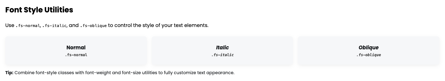
Font Style
PixelLayer UI provides font-style utility classes to control the style of text. You can easily switch text between normal, italic, or oblique without writing extra CSS. These classes are predefined and reusable. Apply them to any heading, paragraph, or label to make your typography consistent and visually appealing.
Tips:
-
fs-*→ Font style -
.fs-normal→ Default normal text -
.fs-italic→ Italicized text -
.fs-oblique→ Oblique text -
Combine these with font-size and font-weight utilities for full control over typography.
| Class | Description | Example |
|---|---|---|
.fs-normal |
Normal text | <p class="fs-normal">Normal Text</p> |
.fs-italic |
Italic text | <p class="fs-italic">Italic Text</p> |
.fs-oblique |
Oblique text | <p class="fs-oblique">Oblique Text</p> |
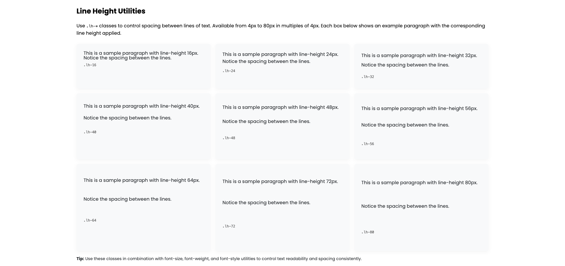
Line Height
PixelLayer UI provides line-height utility classes to control the spacing between lines of text. You can set line height from 4px to 80px in multiples of 4px using .lh-* classes. These classes are predefined and reusable. Apply them to headings, paragraphs, or any text element for consistent, readable, and visually balanced typography.
Tips:
-
lh-*→ Line height -
The number after
lh-indicates the line height in pixels -
Combine with font-size, font-weight, and font-style utilities to fully control text appearance
| Class | Description | Example |
|---|---|---|
.lh-4 |
4px line height | <p class="lh-4">Text</p> |
.lh-8 |
8px line height | <p class="lh-8">Text</p> |
.lh-12 |
12px line height | <p class="lh-12">Text</p> |
.lh-16 |
16px line height | <p class="lh-16">Text</p> |
.lh-20 |
20px line height | <p class="lh-20">Text</p> |
.lh-24 |
24px line height | <p class="lh-24">Text</p> |
.lh-28 |
28px line height | <p class="lh-28">Text</p> |
.lh-32 |
32px line height | <p class="lh-32">Text</p> |
.lh-36 |
36px line height | <p class="lh-36">Text</p> |
.lh-40 |
40px line height | <p class="lh-40">Text</p> |
.lh-44 |
44px line height | <p class="lh-44">Text</p> |
.lh-48 |
48px line height | <p class="lh-48">Text</p> |
.lh-52 |
52px line height | <p class="lh-52">Text</p> |
.lh-56 |
56px line height | <p class="lh-56">Text</p> |
.lh-60 |
60px line height | <p class="lh-60">Text</p> |
.lh-64 |
64px line height | <p class="lh-64">Text</p> |
.lh-68 |
68px line height | <p class="lh-68">Text</p> |
.lh-72 |
72px line height | <p class="lh-72">Text</p> |
.lh-76 |
76px line height | <p class="lh-76">Text</p> |
.lh-80 |
80px line height | <p class="lh-80">Text</p> |
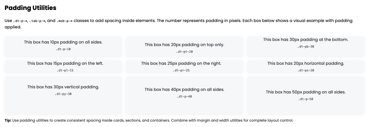
Padding
PixelLayer UI provides padding utility classes to quickly add spacing inside elements. You can apply padding in all directions, individually on top, bottom, left, right, or horizontally/vertically, from 5px to 100px in multiples of 5px. These classes are predefined and reusable. Just add the class to any container, card, or section for consistent spacing across your store.
Tips:
-
dt-p-*→ Desktop padding -
tab-p-*→ Tablet padding -
mob-p-*→ Mobile padding -
-t,-b,-l,-r→ Top, Bottom, Left, Right -
-x→ Left + Right,-y→ Top + Bottom -
Number after the class represents padding in pixels
Desktop Padding
| Class | Description | Example |
|---|---|---|
.dt-p-5 |
Padding 5px all sides | <div class="dt-p-5">Box</div> |
.dt-p-10 |
Padding 10px all sides | <div class="dt-p-10">Box</div> |
.dt-p-15 |
Padding 15px all sides | <div class="dt-p-15">Box</div> |
.dt-p-20 |
Padding 20px all sides | <div class="dt-p-20">Box</div> |
.dt-p-25 |
Padding 25px all sides | <div class="dt-p-25">Box</div> |
.dt-p-30 |
Padding 30px all sides | <div class="dt-p-30">Box</div> |
.dt-p-35 |
Padding 35px all sides | <div class="dt-p-35">Box</div> |
.dt-p-40 |
Padding 40px all sides | <div class="dt-p-40">Box</div> |
.dt-p-45 |
Padding 45px all sides | <div class="dt-p-45">Box</div> |
.dt-p-50 |
Padding 50px all sides | <div class="dt-p-50">Box</div> |
.dt-p-55 |
Padding 55px all sides | <div class="dt-p-55">Box</div> |
.dt-p-60 |
Padding 60px all sides | <div class="dt-p-60">Box</div> |
.dt-p-65 |
Padding 65px all sides | <div class="dt-p-65">Box</div> |
.dt-p-70 |
Padding 70px all sides | <div class="dt-p-70">Box</div> |
.dt-p-75 |
Padding 75px all sides | <div class="dt-p-75">Box</div> |
.dt-p-80 |
Padding 80px all sides | <div class="dt-p-80">Box</div> |
.dt-p-85 |
Padding 85px all sides | <div class="dt-p-85">Box</div> |
.dt-p-90 |
Padding 90px all sides | <div class="dt-p-90">Box</div> |
.dt-p-95 |
Padding 95px all sides | <div class="dt-p-95">Box</div> |
.dt-p-100 |
Padding 100px all sides | <div class="dt-p-100">Box</div> |
Some Directional Padding Examples Desktop
| Class | Description | Example |
|---|---|---|
.dt-pt-20 |
Padding-top 20px | <div class="dt-pt-20">Box</div> |
.dt-pb-30 |
Padding-bottom 30px | <div class="dt-pb-30">Box</div> |
.dt-pl-15 |
Padding-left 15px | <div class="dt-pl-15">Box</div> |
.dt-pr-25 |
Padding-right 25px | <div class="dt-pr-25">Box</div> |
.dt-px-20 |
Left + Right padding 20px | <div class="dt-px-20">Box</div> |
.dt-py-30 |
Top + Bottom padding 30px | <div class="dt-py-30">Box</div> |
Tablet Padding
| Class | Description | Example |
|---|---|---|
.tab-p-5 |
Padding 5px all sides | <div class="tab-p-5">Box</div> |
.tab-p-10 |
Padding 10px all sides | <div class="tab-p-10">Box</div> |
.tab-p-15 |
Padding 15px all sides | <div class="tab-p-15">Box</div> |
.tab-p-20 |
Padding 20px all sides | <div class="tab-p-20">Box</div> |
.tab-p-25 |
Padding 25px all sides | <div class="tab-p-25">Box</div> |
.tab-p-30 |
Padding 30px all sides | <div class="tab-p-30">Box</div> |
.tab-p-35 |
Padding 35px all sides | <div class="tab-p-35">Box</div> |
.tab-p-40 |
Padding 40px all sides | <div class="tab-p-40">Box</div> |
.tab-p-45 |
Padding 45px all sides | <div class="tab-p-45">Box</div> |
.tab-p-50 |
Padding 50px all sides | <div class="tab-p-50">Box</div> |
.tab-p-55 |
Padding 55px all sides | <div class="tab-p-55">Box</div> |
.tab-p-60 |
Padding 60px all sides | <div class="tab-p-60">Box</div> |
.tab-p-65 |
Padding 65px all sides | <div class="tab-p-65">Box</div> |
.tab-p-70 |
Padding 70px all sides | <div class="tab-p-70">Box</div> |
.tab-p-75 |
Padding 75px all sides | <div class="tab-p-75">Box</div> |
.tab-p-80 |
Padding 80px all sides | <div class="tab-p-80">Box</div> |
.tab-p-85 |
Padding 85px all sides | <div class="tab-p-85">Box</div> |
.tab-p-90 |
Padding 90px all sides | <div class="tab-p-90">Box</div> |
.tab-p-95 |
Padding 95px all sides | <div class="tab-p-95">Box</div> |
.tab-p-100 |
Padding 100px all sides | <div class="tab-p-100">Box</div> |
Some Directional Padding Examples Tablet
| Class | Description | Example |
|---|---|---|
.tab-pt-20 |
Padding-top 20px | <div class="tab-pt-20">Box</div> |
.tab-pb-30 |
Padding-bottom 30px | <div class="tab-pb-30">Box</div> |
.tab-pl-15 |
Padding-left 15px | <div class="tab-pl-15">Box</div> |
.tab-pr-25 |
Padding-right 25px | <div class="tab-pr-25">Box</div> |
.tab-px-20 |
Left + Right padding 20px | <div class="tab-px-20">Box</div> |
.tab-py-30 |
Top + Bottom padding 30px | <div class="tab-py-30">Box</div> |
Mobile Padding
| Class | Description | Example |
|---|---|---|
.mob-p-5 |
Padding 5px all sides | <div class="mob-p-5">Box</div> |
.mob-p-10 |
Padding 10px all sides | <div class="mob-p-10">Box</div> |
.mob-p-15 |
Padding 15px all sides | <div class="mob-p-15">Box</div> |
.mob-p-20 |
Padding 20px all sides | <div class="mob-p-20">Box</div> |
.mob-p-25 |
Padding 25px all sides | <div class="mob-p-25">Box</div> |
.mob-p-30 |
Padding 30px all sides | <div class="mob-p-30">Box</div> |
.mob-p-35 |
Padding 35px all sides | <div class="mob-p-35">Box</div> |
.mob-p-40 |
Padding 40px all sides | <div class="mob-p-40">Box</div> |
.mob-p-45 |
Padding 45px all sides | <div class="mob-p-45">Box</div> |
.mob-p-50 |
Padding 50px all sides | <div class="mob-p-50">Box</div> |
.mob-p-55 |
Padding 55px all sides | <div class="mob-p-55">Box</div> |
.mob-p-60 |
Padding 60px all sides | <div class="mob-p-60">Box</div> |
.mob-p-65 |
Padding 65px all sides | <div class="mob-p-65">Box</div> |
.mob-p-70 |
Padding 70px all sides | <div class="mob-p-70">Box</div> |
.mob-p-75 |
Padding 75px all sides | <div class="mob-p-75">Box</div> |
.mob-p-80 |
Padding 80px all sides | <div class="mob-p-80">Box</div> |
.mob-p-85 |
Padding 85px all sides | <div class="mob-p-85">Box</div> |
.mob-p-90 |
Padding 90px all sides | <div class="mob-p-90">Box</div> |
.mob-p-95 |
Padding 95px all sides | <div class="mob-p-95">Box</div> |
.mob-p-100 |
Padding 100px all sides | <div class="mob-p-100">Box</div> |
Some Directional Padding Examples Mobile
| Class | Description | Example |
|---|---|---|
.mob-pt-20 |
Padding-top 20px | <div class="mob-pt-20">Box</div> |
.mob-pb-30 |
Padding-bottom 30px | <div class="mob-pb-30">Box</div> |
.mob-pl-15 |
Padding-left 15px | <div class="mob-pl-15">Box</div> |
.mob-pr-25 |
Padding-right 25px | <div class="mob-pr-25">Box</div> |
.mob-px-20 |
Left + Right padding 20px | <div class="mob-px-20">Box</div> |
.mob-py-30 |
Top + Bottom padding 30px | <div class="mob-py-30">Box</div> |
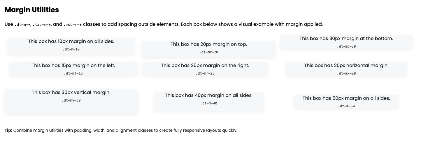
Margin
PixelLayer UI provides margin utility classes to quickly add spacing outside elements. You can apply margin in all directions, individually on top, bottom, left, right, or horizontally/vertically, from 5px to 100px in multiples of 5px. These classes are predefined and reusable. Use them on cards, sections, or containers for consistent spacing across your store.
Tips:
-
dt-m-*→ Desktop margin -
tab-m-*→ Tablet margin -
mob-m-*→ Mobile margin -
-t,-b,-l,-r→ Top, Bottom, Left, Right -
-x→ Left + Right,-y→ Top + Bottom -
Number after the class represents margin in pixels
Desktop Margin
| Class | Description | Example |
|---|---|---|
.dt-m-5 |
Margin 5px all sides | <div class="dt-m-5">Box</div> |
.dt-m-10 |
Margin 10px all sides | <div class="dt-m-10">Box</div> |
.dt-m-15 |
Margin 15px all sides | <div class="dt-m-15">Box</div> |
.dt-m-20 |
Margin 20px all sides | <div class="dt-m-20">Box</div> |
.dt-m-25 |
Margin 25px all sides | <div class="dt-m-25">Box</div> |
.dt-m-30 |
Margin 30px all sides | <div class="dt-m-30">Box</div> |
.dt-m-35 |
Margin 35px all sides | <div class="dt-m-35">Box</div> |
.dt-m-40 |
Margin 40px all sides | <div class="dt-m-40">Box</div> |
.dt-m-45 |
Margin 45px all sides | <div class="dt-m-45">Box</div> |
.dt-m-50 |
Margin 50px all sides | <div class="dt-m-50">Box</div> |
.dt-m-55 |
Margin 55px all sides | <div class="dt-m-55">Box</div> |
.dt-m-60 |
Margin 60px all sides | <div class="dt-m-60">Box</div> |
.dt-m-65 |
Margin 65px all sides | <div class="dt-m-65">Box</div> |
.dt-m-70 |
Margin 70px all sides | <div class="dt-m-70">Box</div> |
.dt-m-75 |
Margin 75px all sides | <div class="dt-m-75">Box</div> |
.dt-m-80 |
Margin 80px all sides | <div class="dt-m-80">Box</div> |
.dt-m-85 |
Margin 85px all sides | <div class="dt-m-85">Box</div> |
.dt-m-90 |
Margin 90px all sides | <div class="dt-m-90">Box</div> |
.dt-m-95 |
Margin 95px all sides | <div class="dt-m-95">Box</div> |
.dt-m-100 |
Margin 100px all sides | <div class="dt-m-100">Box</div> |
Some Directional Margin Examples Desktop
| Class | Description | Example |
|---|---|---|
.dt-mt-20 |
Margin-top 20px | <div class="dt-mt-20">Box</div> |
.dt-mb-30 |
Margin-bottom 30px | <div class="dt-mb-30">Box</div> |
.dt-ml-15 |
Margin-left 15px | <div class="dt-ml-15">Box</div> |
.dt-mr-25 |
Margin-right 25px | <div class="dt-mr-25">Box</div> |
.dt-mx-20 |
Left + Right margin 20px | <div class="dt-mx-20">Box</div> |
.dt-my-30 |
Top + Bottom margin 30px | <div class="dt-my-30">Box</div> |
Tablet Margin
| Class | Description | Example |
|---|---|---|
.tab-m-5 |
Margin 5px all sides | <div class="tab-m-5">Box</div> |
.tab-m-10 |
Margin 10px all sides | <div class="tab-m-10">Box</div> |
.tab-m-15 |
Margin 15px all sides | <div class="tab-m-15">Box</div> |
.tab-m-20 |
Margin 20px all sides | <div class="tab-m-20">Box</div> |
.tab-m-25 |
Margin 25px all sides | <div class="tab-m-25">Box</div> |
.tab-m-30 |
Margin 30px all sides | <div class="tab-m-30">Box</div> |
.tab-m-35 |
Margin 35px all sides | <div class="tab-m-35">Box</div> |
.tab-m-40 |
Margin 40px all sides | <div class="tab-m-40">Box</div> |
.tab-m-45 |
Margin 45px all sides | <div class="tab-m-45">Box</div> |
.tab-m-50 |
Margin 50px all sides | <div class="tab-m-50">Box</div> |
.tab-m-55 |
Margin 55px all sides | <div class="tab-m-55">Box</div> |
.tab-m-60 |
Margin 60px all sides | <div class="tab-m-60">Box</div> |
.tab-m-65 |
Margin 65px all sides | <div class="tab-m-65">Box</div> |
.tab-m-70 |
Margin 70px all sides | <div class="tab-m-70">Box</div> |
.tab-m-75 |
Margin 75px all sides | <div class="tab-m-75">Box</div> |
.tab-m-80 |
Margin 80px all sides | <div class="tab-m-80">Box</div> |
.tab-m-85 |
Margin 85px all sides | <div class="tab-m-85">Box</div> |
.tab-m-90 |
Margin 90px all sides | <div class="tab-m-90">Box</div> |
.tab-m-95 |
Margin 95px all sides | <div class="tab-m-95">Box</div> |
.tab-m-100 |
Margin 100px all sides | <div class="tab-m-100">Box</div> |
Some Directional Padding Examples Tablet
| Class | Description | Example |
|---|---|---|
.tab-mt-20 |
Margin-top 20px | <div class="tab-mt-20">Box</div> |
.tab-mb-30 |
Margin-bottom 30px | <div class="tab-mb-30">Box</div> |
.tab-ml-15 |
Margin-left 15px | <div class="tab-ml-15">Box</div> |
.tab-mr-25 |
Margin-right 25px | <div class="tab-mr-25">Box</div> |
.tab-mx-20 |
Left + Right margin 20px | <div class="tab-mx-20">Box</div> |
.tab-my-30 |
Top + Bottom margin 30px | <div class="tab-my-30">Box</div> |
Mobile Margin
| Class | Description | Example |
|---|---|---|
.mob-m-5 |
Margin 5px all sides | <div class="mob-m-5">Box</div> |
.mob-m-10 |
Margin 10px all sides | <div class="mob-m-10">Box</div> |
.mob-m-15 |
Margin 15px all sides | <div class="mob-m-15">Box</div> |
.mob-m-20 |
Margin 20px all sides | <div class="mob-m-20">Box</div> |
.mob-m-25 |
Margin 25px all sides | <div class="mob-m-25">Box</div> |
.mob-m-30 |
Margin 30px all sides | <div class="mob-m-30">Box</div> |
.mob-m-35 |
Margin 35px all sides | <div class="mob-m-35">Box</div> |
.mob-m-40 |
Margin 40px all sides | <div class="mob-m-40">Box</div> |
.mob-m-45 |
Margin 45px all sides | <div class="mob-m-45">Box</div> |
.mob-m-50 |
Margin 50px all sides | <div class="mob-m-50">Box</div> |
.mob-m-55 |
Margin 55px all sides | <div class="mob-m-55">Box</div> |
.mob-m-60 |
Margin 60px all sides | <div class="mob-m-60">Box</div> |
.mob-m-65 |
Margin 65px all sides | <div class="mob-m-65">Box</div> |
.mob-m-70 |
Margin 70px all sides | <div class="mob-m-70">Box</div> |
.mob-m-75 |
Margin 75px all sides | <div class="mob-m-75">Box</div> |
.mob-m-80 |
Margin 80px all sides | <div class="mob-m-80">Box</div> |
.mob-m-85 |
Margin 85px all sides | <div class="mob-m-85">Box</div> |
.mob-m-90 |
Margin 90px all sides | <div class="mob-m-90">Box</div> |
.mob-m-95 |
Margin 95px all sides | <div class="mob-m-95">Box</div> |
.mob-m-100 |
Margin 100px all sides | <div class="mob-m-100">Box</div> |
Some Directional Padding Examples Mobile
| Class | Description | Example |
|---|---|---|
.mob-mt-20 |
Margin-top 20px | <div class="mob-mt-20">Box</div> |
.mob-mb-30 |
Margin-bottom 30px | <div class="mob-mb-30">Box</div> |
.mob-ml-15 |
Margin-left 15px | <div class="mob-ml-15">Box</div> |
.mob-mr-25 |
Margin-right 25px | <div class="mob-mr-25">Box</div> |
.mob-mx-20 |
Left + Right margin 20px | <div class="mob-mx-20">Box</div> |
.mob-my-30 |
Top + Bottom margin 30px | <div class="mob-my-30">Box</div> |
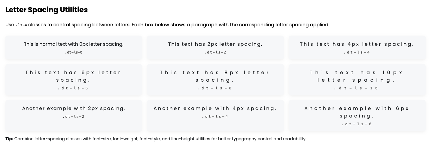
Letter Spacing
PixelLayer UI provides letter-spacing utility classes to control the spacing between characters in text. You can apply letter spacing from 0px to 10px using .ls-* classes. These classes are predefined and reusable. Apply them to headings, paragraphs, or labels to make typography readable, balanced, and visually appealing.
Tips:
-
ls-*→ Letter spacing -
dt-ls-*→ Desktop letter spacing -
tab-ls-*→ Tablet letter spacing -
mob-ls-*→ Mobile letter spacing -
Number after
ls-represents spacing in pixels -
Combine with font-size, font-weight, font-style, and line-height utilities for full typography control
Letter Spacing Utilities (Desktop)
| Class | Description | Example |
|---|---|---|
.dt-ls-0 |
No extra spacing | <p class="dt-ls-0">Letter Spacing 0px</p> |
.dt-ls-1 |
1px spacing | <p class="dt-ls-1">Letter Spacing 1px</p> |
.dt-ls-2 |
2px spacing | <p class="dt-ls-2">Letter Spacing 2px</p> |
.dt-ls-3 |
3px spacing | <p class="dt-ls-3">Letter Spacing 3px</p> |
.dt-ls-4 |
4px spacing | <p class="dt-ls-4">Letter Spacing 4px</p> |
.dt-ls-5 |
5px spacing | <p class="dt-ls-5">Letter Spacing 5px</p> |
.dt-ls-6 |
6px spacing | <p class="dt-ls-6">Letter Spacing 6px</p> |
.dt-ls-7 |
7px spacing | <p class="dt-ls-7">Letter Spacing 7px</p> |
.dt-ls-8 |
8px spacing | <p class="dt-ls-8">Letter Spacing 8px</p> |
.dt-ls-9 |
9px spacing | <p class="dt-ls-9">Letter Spacing 9px</p> |
.dt-ls-10 |
10px spacing | <p class="dt-ls-10">Letter Spacing 10px</p> |
Letter Spacing Utilities (Tablet)
| Class | Description | Example |
|---|---|---|
.tab-ls-0 |
No extra spacing | <p class="tab-ls-0">Letter Spacing 0px</p> |
.tab-ls-1 |
1px spacing | <p class="tab-ls-1">Letter Spacing 1px</p> |
.tab-ls-2 |
2px spacing | <p class="tab-ls-2">Letter Spacing 2px</p> |
.tab-ls-3 |
3px spacing | <p class="tab-ls-3">Letter Spacing 3px</p> |
.tab-ls-4 |
4px spacing | <p class="tab-ls-4">Letter Spacing 4px</p> |
.tab-ls-5 |
5px spacing | <p class="tab-ls-5">Letter Spacing 5px</p> |
.tab-ls-6 |
6px spacing | <p class="tab-ls-6">Letter Spacing 6px</p> |
.tab-ls-7 |
7px spacing | <p class="tab-ls-7">Letter Spacing 7px</p> |
.tab-ls-8 |
8px spacing | <p class="tab-ls-8">Letter Spacing 8px</p> |
.tab-ls-9 |
9px spacing | <p class="tab-ls-9">Letter Spacing 9px</p> |
.tab-ls-10 |
10px spacing | <p class="tab-ls-10">Letter Spacing 10px</p> |
Letter Spacing Utilities (Mobile)
| Class | Description | Example |
|---|---|---|
.mob-ls-0 |
No extra spacing | <p class="mob-ls-0">Letter Spacing 0px</p> |
.mob-ls-1 |
1px spacing | <p class="mob-ls-1">Letter Spacing 1px</p> |
.mob-ls-2 |
2px spacing | <p class="mob-ls-2">Letter Spacing 2px</p> |
.mob-ls-3 |
3px spacing | <p class="mob-ls-3">Letter Spacing 3px</p> |
.mob-ls-4 |
4px spacing | <p class="mob-ls-4">Letter Spacing 4px</p> |
.mob-ls-5 |
5px spacing | <p class="mob-ls-5">Letter Spacing 5px</p> |
.mob-ls-6 |
6px spacing | <p class="mob-ls-6">Letter Spacing 6px</p> |
.mob-ls-7 |
7px spacing | <p class="mob-ls-7">Letter Spacing 7px</p> |
.mob-ls-8 |
8px spacing | <p class="mob-ls-8">Letter Spacing 8px</p> |
.mob-ls-9 |
9px spacing | <p class="mob-ls-9">Letter Spacing 9px</p> |
.mob-ls-10 |
10px spacing | <p class="mob-ls-10">Letter Spacing 10px</p> |
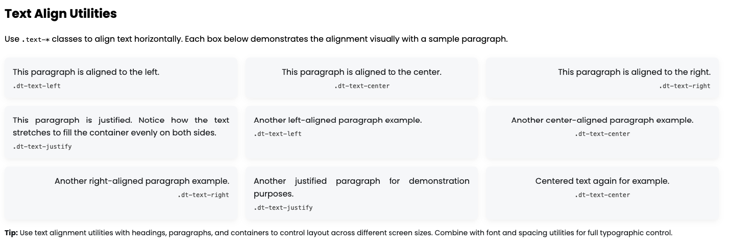
Text Align
PixelLayer UI provides text alignment utility classes to control the horizontal alignment of text. You can align text to the left, center, right, or justify. These classes are predefined and reusable. Apply them to headings, paragraphs, or any text container for consistent typography alignment across your store.
Tips:
-
text-*→ Text alignment -
dt-text-*→ Desktop text alignment -
tab-text-*→ Tablet text alignment -
mob-text-*→ Mobile text alignment -
Use these classes on paragraphs, headings, buttons, or div containers
-
Combine with font-size, font-weight, font-style, and line-height for complete text styling
Text Align Utilities (Desktop)
| Class | Description | Example |
|---|---|---|
.dt-text-left |
Align text to left | <p class="dt-text-left">Left aligned text</p> |
.dt-text-center |
Align text to center | <p class="dt-text-center">Center aligned text</p> |
.dt-text-right |
Align text to right | <p class="dt-text-right">Right aligned text</p> |
.dt-text-justify |
Justify text | <p class="dt-text-justify">Justified paragraph text</p> |
Text Align Utilities (Tablet)
| Class | Description | Example |
|---|---|---|
.tab-text-left |
Align text to left | <p class="tab-text-left">Left aligned text</p> |
.tab-text-center |
Align text to center | <p class="tab-text-center">Center aligned text</p> |
.tab-text-right |
Align text to right | <p class="tab-text-right">Right aligned text</p> |
.tab-text-justify |
Justify text | <p class="tab-text-justify">Justified paragraph text</p> |
Text Align Utilities (Mobile)
| Class | Description | Example |
|---|---|---|
.mob-text-left |
Align text to left | <p class="mob-text-left">Left aligned text</p> |
.mob-text-center |
Align text to center | <p class="mob-text-center">Center aligned text</p> |
.mob-text-right |
Align text to right | <p class="mob-text-right">Right aligned text</p> |
.mob-text-justify |
Justify text | <p class="mob-text-justify">Justified paragraph text</p> |
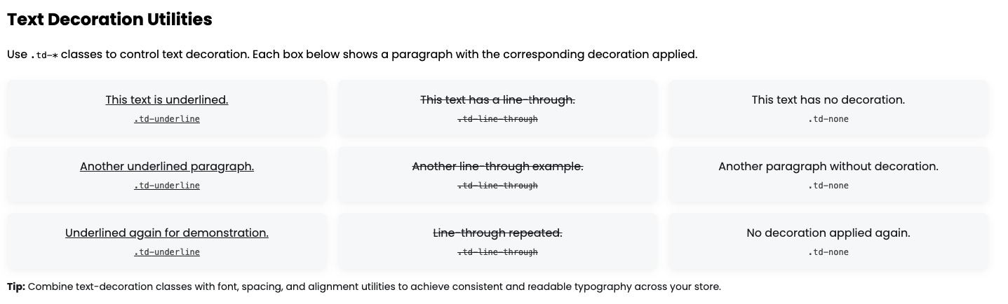
Text Decoration
PixelLayer UI provides text-decoration utility classes to control the decoration of text. You can apply underline, line-through, or remove all text decoration with simple classes. These classes are predefined and reusable. Apply them to headings, paragraphs, links, or buttons for consistent text styling.
Tips:
-
td-*→ Text decoration -
.td-underline→ Adds underline -
.td-line-through→ Adds line-through -
.td-none→ Removes all text decoration -
Use in combination with font-size, font-weight, font-style, letter-spacing, and text-align for full typography control
| Class | Description | Example |
|---|---|---|
.td-underline |
Underlines text | <p class="td-underline">This text is underlined</p> |
.td-line-through |
Adds a line-through | <p class="td-line-through">This text is struck through</p> |
.td-none |
Removes all text decoration | <p class="td-none">This text has no decoration</p> |
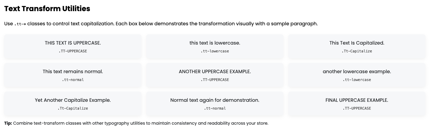
Text Transform
PixelLayer UI provides text-transform utility classes to control capitalization of text. You can convert text to uppercase, lowercase, capitalize each word, or leave it as normal. These classes are predefined and reusable. Apply them to headings, paragraphs, buttons, or labels for consistent text styling across your store.
Tips:
-
tt-*→ Text transform -
.tt-uppercase→ Converts text to uppercase -
.tt-lowercase→ Converts text to lowercase -
.tt-capitalize→ Capitalizes the first letter of each word -
.tt-normal→ Removes any text transformation, keeping original text -
Combine with font-size, font-weight, font-style, letter-spacing, and text-align for complete typography control
| Class | Description | Example |
|---|---|---|
.tt-uppercase |
Converts text to uppercase | <p class="tt-uppercase">This text is uppercase</p> |
.tt-lowercase |
Converts text to lowercase | <p class="tt-lowercase">THIS TEXT IS LOWERCASE</p> |
.tt-capitalize |
Capitalizes first letter of words | <p class="tt-capitalize">this text is capitalized</p> |
.tt-normal |
No transformation applied | <p class="tt-normal">This text remains normal</p> |
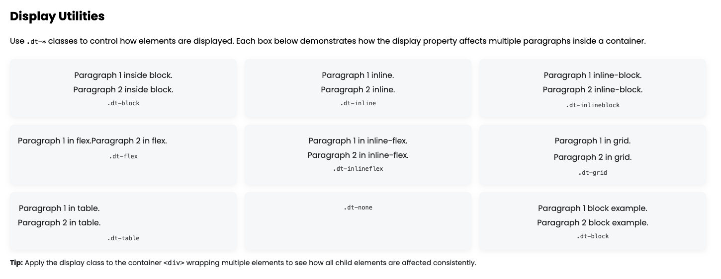
Display
PixelLayer UI provides display utility classes to control the display behavior of elements. You can quickly switch elements to block, inline, inline-block, flex, inline-flex, grid, table, or none. These classes are predefined and reusable. Apply them to divs, containers, images, or any HTML element to control layout and visibility responsively.
Tips:
-
dt-*→ Desktop display -
tab-*→ Tablet display -
mob-*→ Mobile display -
.dt-none→ Hide element -
.dt-flex,.dt-inflex→ Use for flexbox layouts -
.dt-grid→ Use for grid layouts -
Combine with margin, padding, alignment, and width utilities for flexible layout design
Display Utilities (Desktop)
| Class | Description | Example |
|---|---|---|
.dt-block |
Display block | <div class="dt-block">Block element</div> |
.dt-inline |
Display inline | <span class="dt-inline">Inline element</span> |
.dt-inlineblock |
Display inline-block | <span class="dt-inlineblock">Inline-block</span> |
.dt-flex |
Display flex | <div class="dt-flex">Flex container</div> |
.dt-inlineflex |
Display inline-flex | <div class="dt-inflex">Inline-flex container</div> |
.dt-grid |
Display grid | <div class="dt-grid">Grid container</div> |
.dt-table |
Display table | <div class="dt-table">Table element</div> |
.dt-none |
Hide element | <div class="dt-none">Hidden element</div> |
Display Utilities (Tablet)
| Class | Description | Example |
|---|---|---|
.tab-block |
Display block | <div class="tab-block">Block element</div> |
.tab-inline |
Display inline | <span class="tab-inline">Inline element</span> |
.tab-inlineblock |
Display inline-block | <span class="tab-inlineblock">Inline-block</span> |
.tab-flex |
Display flex | <div class="tab-flex">Flex container</div> |
.tab-inlineflex |
Display inline-flex | <div class="tab-inflex">Inline-flex container</div> |
.tab-grid |
Display grid | <div class="tab-grid">Grid container</div> |
.tab-table |
Display table | <div class="tab-table">Table element</div> |
.tab-none |
Hide element | <div class="tab-none">Hidden element</div> |
Display Utilities (Mobile)
| Class | Description | Example |
|---|---|---|
.mob-block |
Display block | <div class="mob-block">Block element</div> |
.mob-inline |
Display inline | <span class="mob-inline">Inline element</span> |
.mob-inlineblock |
Display inline-block | <span class="mob-inlineblock">Inline-block</span> |
.mob-flex |
Display flex | <div class="mob-flex">Flex container</div> |
.mob-inlineflex |
Display inline-flex | <div class="mob-inflex">Inline-flex container</div> |
.mob-grid |
Display grid | <div class="mob-grid">Grid container</div> |
.mob-table |
Display table | <div class="mob-table">Table element</div> |
.mob-none |
Hide element | <div class="mob-none">Hidden element</div> |
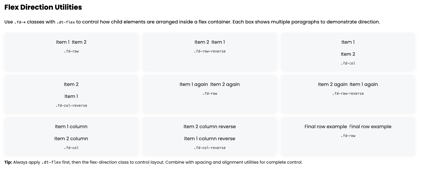
Flex Direction
PixelLayer UI provides flex-direction utility classes to control the main axis direction of flex containers. You can set a flex container to row, row-reverse, column, or column-reverse. These classes are predefined and reusable. Apply them to a flex container to control layout flow of child elements.
Tips:
-
fd-*→ Flex direction -
.fd-row→ Arrange children horizontally (default) -
.fd-row-reverse→ Arrange children horizontally in reverse order -
.fd-col→ Arrange children vertically -
.fd-col-reverse→ Arrange children vertically in reverse order -
Use in combination with flex, spacing, alignment, and display utilities for responsive layouts
| Class | Description | Example |
|---|---|---|
.fd-row |
Flex children in a row | <div class="dt-flex fd-row"><p>1</p><p>2</p></div> |
.fd-row-reverse |
Flex children in a reversed row | <div class="dt-flex fd-row-reverse"><p>1</p><p>2</p></div> |
.fd-col |
Flex children in a column | <div class="dt-flex fd-col"><p>1</p><p>2</p></div> |
.fd-col-reverse |
Flex children in a reversed column | <div class="dt-flex fd-col-reverse"><p>1</p><p>2</p></div> |
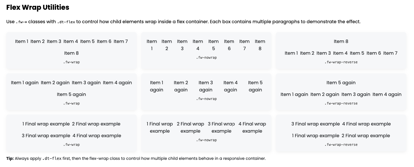
Flex Wrap
PixelLayer UI provides flex-wrap utility classes to control how child elements wrap inside a flex container. You can allow elements to wrap to the next line, prevent wrapping, or reverse the wrap order. These classes are predefined and reusable. Apply them to flex containers to control responsive layouts for rows of content.
Tips:
-
fw-*→ Flex wrap -
.fw-wrap→ Allows children to wrap onto multiple lines -
.fw-nowrap→ Prevents children from wrapping, keeping them on a single line -
.fw-wrap-reverse→ Wraps children but reverses the order of the wrapped lines -
Use with .dt-flex, flex-direction, justify-content, and align-items for complete control
| Class | Description | Example |
|---|---|---|
.fw-wrap |
Wrap flex children onto new lines | <div class="dt-flex fw-wrap"><p>1</p><p>2</p><p>3</p></div> |
.fw-nowrap |
Prevent children from wrapping | <div class="dt-flex fw-nowrap"><p>1</p><p>2</p><p>3</p></div> |
.fw-wrap-reverse |
Wrap children in reverse order | <div class="dt-flex fw-wrap-reverse"><p>1</p><p>2</p><p>3</p></div> |
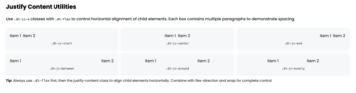
Justify Content
PixelLayer UI provides justify-content utility classes to control the horizontal distribution of items inside a flex container. You can align items to the start, center, end, or distribute space between/around/evenly. These classes are predefined and reusable. Apply them to a flex container to create precise layout alignment for rows of elements.
Tips:
-
jc-*→ Justify content -
.dt-jc-start→ Align children to the left (flex-start) -
.dt-jc-center→ Center children horizontally -
.dt-jc-end→ Align children to the right (flex-end) -
.dt-jc-between→ Distribute children with equal space between them -
.dt-jc-around→ Distribute children with equal space around them -
.dt-jc-evenly→ Distribute children with equal space evenly -
Responsive classes:
-
.tab-jc-*→ Tablet-specific justify content -
.mob-jc-*→ Mobile-specific justify content
-
-
Usage tip: Always combine with
.dt-flexand optionally with flex-direction (.fd-*) and flex-wrap (.fw-*) for full layout control.
Justify Content Utilities (Desktop)
| Class | Description | Example |
|---|---|---|
.dt-jc-start |
Align items to the start | <div class="dt-flex dt-jc-start"><p>1</p><p>2</p></div> |
.dt-jc-center |
Center items horizontally | <div class="dt-flex dt-jc-center"><p>1</p><p>2</p></div> |
.dt-jc-end |
Align items to the end | <div class="dt-flex dt-jc-end"><p>1</p><p>2</p></div> |
.dt-jc-between |
Space items evenly with gaps | <div class="dt-flex dt-jc-between"><p>1</p><p>2</p></div> |
.dt-jc-around |
Space items with space around them | <div class="dt-flex dt-jc-around"><p>1</p><p>2</p></div> |
.dt-jc-evenly |
Space items evenly | <div class="dt-flex dt-jc-evenly"><p>1</p><p>2</p></div> |
Justify Content Utilities (Tablet)
| Class | Description | Example |
|---|---|---|
.tab-jc-start |
Align items to the start | <div class="dt-flex tab-jc-start"><p>1</p><p>2</p></div> |
.tab-jc-center |
Center items horizontally | <div class="dt-flex tab-jc-center"><p>1</p><p>2</p></div> |
.tab-jc-end |
Align items to the end | <div class="dt-flex tab-jc-end"><p>1</p><p>2</p></div> |
.tab-jc-between |
Space items evenly with gaps | <div class="dt-flex tab-jc-between"><p>1</p><p>2</p></div> |
.tab-jc-around |
Space items with space around them | <div class="dt-flex tab-jc-around"><p>1</p><p>2</p></div> |
.tab-jc-evenly |
Space items evenly | <div class="dt-flex tab-jc-evenly"><p>1</p><p>2</p></div> |
Justify Content Utilities (Mobile)
| Class | Description | Example |
|---|---|---|
.mob-jc-start |
Align items to the start | <div class="dt-flex mob-jc-start"><p>1</p><p>2</p></div> |
.mob-jc-center |
Center items horizontally | <div class="dt-flex mob-jc-center"><p>1</p><p>2</p></div> |
.mob-jc-end |
Align items to the end | <div class="dt-flex mob-jc-end"><p>1</p><p>2</p></div> |
.mob-jc-between |
Space items evenly with gaps | <div class="dt-flex mob-jc-between"><p>1</p><p>2</p></div> |
.mob-jc-around |
Space items with space around them | <div class="dt-flex mob-jc-around"><p>1</p><p>2</p></div> |
.mob-jc-evenly |
Space items evenly | <div class="dt-flex mob-jc-evenly"><p>1</p><p>2</p></div> |
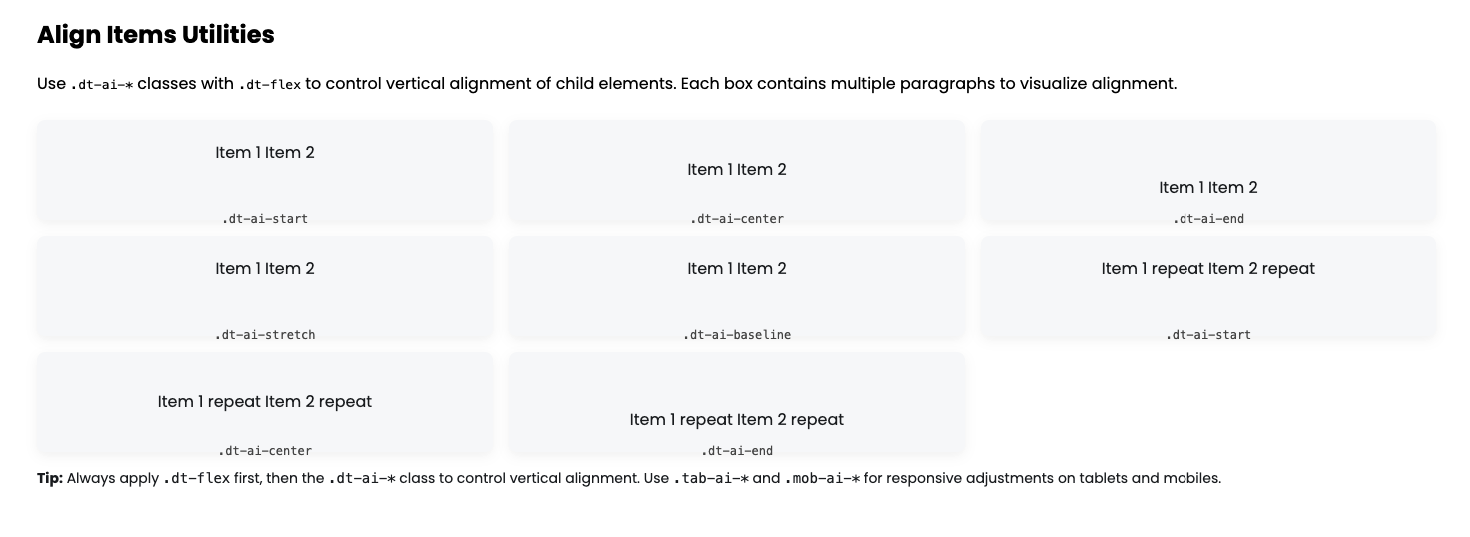
Align Items
PixelLayer UI provides align-items utility classes to control the vertical alignment of child elements inside a flex container. You can align children to the top, center, bottom, stretch, or baseline. These classes are predefined and reusable. Apply them to flex containers to create precise vertical alignment for rows or columns of elements.
Tips:
-
ai-*→ Align items vertically -
.dt-ai-start→ Align children to the top (flex-start) -
.dt-ai-center→ Center children vertically -
.dt-ai-end→ Align children to the bottom (flex-end) -
.dt-ai-stretch→ Stretch children to fill container height -
.dt-ai-baseline→ Align children along their text baseline -
Responsive classes:
-
.tab-ai-*→ Tablet-specific vertical alignment -
.mob-ai-*→ Mobile-specific vertical alignment
-
-
Usage tip: Always combine with
.dt-flex, flex-direction (.fd-*), and flex-wrap (.fw-*) for full control of child alignment.
Align Items Utilities (Desktop)
| Class | Description | Example |
|---|---|---|
.dt-ai-start |
Align items to the top | <div class="dt-flex fd-row dt-ai-start"><p>1</p><p>2</p></div> |
.dt-ai-center |
Center items vertically | <div class="dt-flex fd-row dt-ai-center"><p>1</p><p>2</p></div> |
.dt-ai-end |
Align items to the bottom | <div class="dt-flex fd-row dt-ai-end"><p>1</p><p>2</p></div> |
.dt-ai-stretch |
Stretch items to fill container | <div class="dt-flex fd-row dt-ai-stretch"><p>1</p><p>2</p></div> |
.dt-ai-baseline |
Align items along text baseline | <div class="dt-flex fd-row dt-ai-baseline"><p>1</p><p>2</p></div> |
Align Items Utilities (Tablet)
| Class | Description | Example |
|---|---|---|
.tab-ai-start |
Align items to the top | <div class="dt-flex fd-row tab-ai-start"><p>1</p><p>2</p></div> |
.tab-ai-center |
Center items vertically | <div class="dt-flex fd-row tab-ai-center"><p>1</p><p>2</p></div> |
.tab-ai-end |
Align items to the bottom | <div class="dt-flex fd-row tab-ai-end"><p>1</p><p>2</p></div> |
.tab-ai-stretch |
Stretch items to fill container | <div class="dt-flex fd-row tab-ai-stretch"><p>1</p><p>2</p></div> |
.tab-ai-baseline |
Align items along text baseline | <div class="dt-flex fd-row tab-ai-baseline"><p>1</p><p>2</p></div> |
Align Items Utilities (Mobile)
| Class | Description | Example |
|---|---|---|
.mob-ai-start |
Align items to the top | <div class="dt-flex fd-row mob-ai-start"><p>1</p><p>2</p></div> |
.mob-ai-center |
Center items vertically | <div class="dt-flex fd-row mob-ai-center"><p>1</p><p>2</p></div> |
.mob-ai-end |
Align items to the bottom | <div class="dt-flex fd-row mob-ai-end"><p>1</p><p>2</p></div> |
.mob-ai-stretch |
Stretch items to fill container | <div class="dt-flex fd-row mob-ai-stretch"><p>1</p><p>2</p></div> |
.mob-ai-baseline |
Align items along text baseline | <div class="dt-flex fd-row mob-ai-baseline"><p>1</p><p>2</p></div> |
Position
PixelLayer UI provides position utility classes to control the positioning of elements. You can set elements to static, relative, absolute, fixed, sticky, or initial. These classes are predefined and reusable. Apply them to any element to control its placement within the page or relative to its container.
Tips:
-
pos-*→ Sets the CSSpositionproperty -
.dt-pos-static→ Default static position -
.dt-pos-relative→ Position relative to its normal place -
.dt-pos-absolute→ Position relative to the nearest positioned ancestor -
.dt-pos-fixed→ Fixed to viewport, does not scroll -
.dt-pos-sticky→ Sticks when scrolling past a threshold -
.dt-pos-initial→ Resets to default initial value -
Responsive classes:
-
.tab-pos-*→ Tablet-specific positions -
.mob-pos-*→ Mobile-specific positions
-
-
Usage tip: Combine with top, right, bottom, left utilities for precise placement.
Position Utilities (Desktop)
| Class | Description | Example |
|---|---|---|
.dt-pos-static |
Default static position | <div class="dt-pos-static">Static</div> |
.dt-pos-relative |
Relative to normal position | <div class="dt-pos-relative">Relative</div> |
.dt-pos-absolute |
Positioned absolutely | <div class="dt-pos-absolute">Absolute</div> |
.dt-pos-fixed |
Fixed to viewport | <div class="dt-pos-fixed">Fixed</div> |
.dt-pos-sticky |
Sticks when scrolling | <div class="dt-pos-sticky">Sticky</div> |
.dt-pos-initial |
Resets to initial value | <div class="dt-pos-initial">Initial</div> |
Position Utilities (Tablet)
| Class | Description | Example |
|---|---|---|
.tab-pos-static |
Default static position | <div class="tab-pos-static">Static</div> |
.tab-pos-relative |
Relative to normal position | <div class="tab-pos-relative">Relative</div> |
.tab-pos-absolute |
Positioned absolutely | <div class="tab-pos-absolute">Absolute</div> |
.tab-pos-fixed |
Fixed to viewport | <div class="tab-pos-fixed">Fixed</div> |
.tab-pos-sticky |
Sticks when scrolling | <div class="tab-pos-sticky">Sticky</div> |
.tab-pos-initial |
Resets to initial value | <div class="tab-pos-initial">Initial</div> |
Position Utilities (Mobile)
| Class | Description | Example |
|---|---|---|
.mob-pos-static |
Default static position | <div class="mob-pos-static">Static</div> |
.mob-pos-relative |
Relative to normal position | <div class="mob-pos-relative">Relative</div> |
.mob-pos-absolute |
Positioned absolutely | <div class="mob-pos-absolute">Absolute</div> |
.mob-pos-fixed |
Fixed to viewport | <div class="mob-pos-fixed">Fixed</div> |
.mob-pos-sticky |
Sticks when scrolling | <div class="mob-pos-sticky">Sticky</div> |
.mob-pos-initial |
Resets to initial value | <div class="mob-pos-initial">Initial</div> |
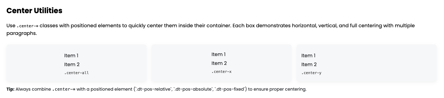
Center Content
PixelLayer UI provides center utility classes to quickly center elements horizontally, vertically, or both. These classes are predefined, reusable, and fully customizable. Use them on positioned elements to easily center them inside their parent container without writing custom CSS.
Tips:
-
center-*→ Centers elements -
.center-all→ Centers element both horizontally and vertically -
.center-x→ Centers element horizontally only -
.center-y→ Centers element vertically only -
Always use with positioned elements (
relative,absolute,fixed,sticky) -
Usage tip: Combine with
.dt-pos-*to control the element’s position.
PixelLayer UI provides center utility classes to quickly center elements horizontally, vertically, or both. These classes are predefined and reusable. Use them on positioned elements to easily center them inside their parent container without writing custom CSS.
Tips:
-
center-*→ Centers elements -
.center-all→ Centers element both horizontally and vertically -
.center-x→ Centers element horizontally only -
.center-y→ Centers element vertically only -
Always use with positioned elements (
relative,absolute,fixed,sticky) -
Usage tip: Combine with
.dt-pos-*to control the element’s position.
| Class | Description | Example |
|---|---|---|
.center-all |
Centers element both horizontally & vertically inside its parent | <div class="dt-pos-relative"><div class="dt-pos-absolute center-all"><p>Item 1</p><p>Item 2</p><code>.center-all</code></div></div> |
.center-x |
Centers element horizontally only inside its parent | <div class="dt-pos-relative"><div class="dt-pos-absolute center-x"><p>Item 1</p><p>Item 2</p><code>.center-x</code></div></div> |
.center-y |
Centers element vertically only inside its parent | <div class="dt-pos-relative"><div class="dt-pos-absolute center-y"><p>Item 1</p><p>Item 2</p><code>.center-y</code></div></div> |
Width
PixelLayer UI provides width utility classes to quickly set element widths in pixels, percentages, or viewport units. These classes are predefined and reusable. Simply apply the class to any block-level or inline-block element to control its width.
Tips:
-
.w-*→ Sets element width -
.w-auto→ Automatic width based on content -
.w-fit→ Fit content width -
.w-0, .w-25, .w-50, .w-75, .w-100→ Width in percentage -
.w-vw-*→ Width in viewport width units (vw) -
Combine with padding/margin utilities for responsive layouts
| Class | Description | Example |
|---|---|---|
.w-auto |
Automatic width based on content | <div class="w-auto bgc-primary">Auto Width</div> |
.w-fit |
Width fits content | <div class="w-fit bgc-secondary">Fit Content</div> |
.w-0 |
Width = 0 | <div class="w-0 bgc-success">0 Width</div> |
.w-25 |
Width = 25% | <div class="w-25 bgc-danger">25% Width</div> |
.w-50 |
Width = 50% | <div class="w-50 bgc-warning">50% Width</div> |
.w-75 |
Width = 75% | <div class="w-75 bgc-info">75% Width</div> |
.w-100 |
Width = 100% | <div class="w-100 bgc-dark">100% Width</div> |
.w-vw-25 |
Width = 25vw | <div class="w-vw-25 bgc-primary">25vw Width</div> |
.w-vw-50 |
Width = 50vw | <div class="w-vw-50 bgc-secondary">50vw Width</div> |
.w-vw-75 |
Width = 75vw | <div class="w-vw-75 bgc-success">75vw Width</div> |
.w-vw-100 |
Width = 100vw | <div class="w-vw-100 bgc-danger">100vw Width</div> |
Height
PixelLayer UI provides height utility classes to quickly set element heights in pixels, percentages, or viewport units. These classes are predefined and reusable. Simply apply the class to any block-level element to control its height.
Tips:
-
.h-*→ Sets element height -
.h-auto→ Automatic height based on content -
.h-0, .h-25, .h-50, .h-75, .h-100→ Height in percentage -
.h-vh-*→ Height in viewport height units (vh) -
Combine with width or padding utilities for flexible layouts
| Class | Description | Example |
|---|---|---|
.h-auto |
Automatic height based on content | <div class="h-auto bgc-primary">Auto Height</div> |
.h-0 |
Height = 0 | <div class="h-0 bgc-success">0 Height</div> |
.h-25 |
Height = 25% | <div class="h-25 bgc-danger">25% Height</div> |
.h-50 |
Height = 50% | <div class="h-50 bgc-warning">50% Height</div> |
.h-75 |
Height = 75% | <div class="h-75 bgc-info">75% Height</div> |
.h-100 |
Height = 100% | <div class="h-100 bgc-dark">100% Height</div> |
.h-vh-25 |
Height = 25vh | <div class="h-vh-25 bgc-primary">25vh Height</div> |
.h-vh-50 |
Height = 50vh | <div class="h-vh-50 bgc-secondary">50vh Height</div> |
.h-vh-75 |
Height = 75vh | <div class="h-vh-75 bgc-success">75vh Height</div> |
.h-vh-100 |
Height = 100vh | <div class="h-vh-100 bgc-danger">100vh Height</div> |
Overflow
PixelLayer UI provides overflow utility classes to control how content behaves when it exceeds the container. These classes work for both horizontal and vertical overflow, and can be applied to any block-level element.
Tips:
-
.ov-*→ Controls overall overflow -
.ovx-*→ Controls horizontal overflow (overflow-x) -
.ovy-*→ Controls vertical overflow (overflow-y) -
Use
.ov-autofor scrollbars that appear automatically when needed. -
Combine with width, height, or max-height utilities for better effect.
| Class | Description |
|---|---|
.ov-hidden |
Hide overflowing content |
.ov-scroll |
Always show scrollbars |
.ov-auto |
Show scrollbars only if needed |
.ov-visible |
Content can overflow freely |
.ovx-hidden |
Hide horizontal overflow |
.ovx-scroll |
Always horizontal scrollbar |
.ovx-auto |
Horizontal scrollbar if needed |
.ovx-visible |
Horizontal content can overflow |
.ovy-hidden |
Hide vertical overflow |
.ovy-scroll |
Always vertical scrollbar |
.ovy-auto |
Vertical scrollbar if needed |
.ovy-visible |
Vertical content can overflow |
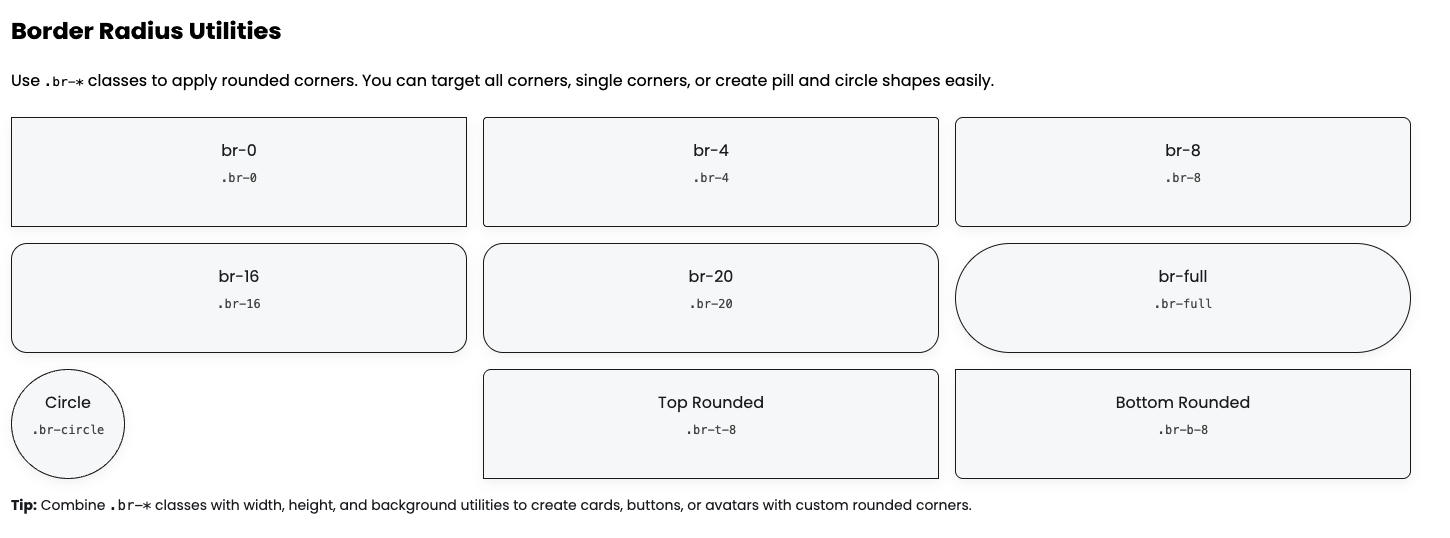
Border Radius
PixelLayer UI provides border radius utility classes to quickly apply rounded corners to any element. You can use small, medium, large, full, or circular radii, as well as target individual corners. These classes are predefined and reusable.
Tips:
-
.br-*→ Sets overall border radius -
.br-t-*,.br-b-*,.br-l-*,.br-r-*→ Sets top, bottom, left, right corners individually -
.br-tl-*,.br-tr-*,.br-bl-*,.br-br-*→ Sets specific single corner radius -
.br-full→ Fully rounded (pill) -
.br-circle→ Perfect circle (works on square elements) -
Combine with background, width, height, and border utilities for stylish UI components
PixelLayer UI provides border radius utility classes to quickly apply rounded corners to any element. You can use small, medium, large, full, or circular radii, as well as target individual corners. These classes are predefined, reusable, and fully customizable via your Shopify app admin panel.
Tips:
-
.br-*→ Sets overall border radius -
.br-t-*,.br-b-*,.br-l-*,.br-r-*→ Sets top, bottom, left, right corners individually -
.br-tl-*,.br-tr-*,.br-bl-*,.br-br-*→ Sets specific single corner radius -
.br-full→ Fully rounded (pill) -
.br-circle→ Perfect circle (works on square elements) -
Combine with background, width, height, and border utilities for stylish UI components
| Class | Description | Example |
|---|---|---|
.br-0 |
No border radius | <div class="br-0 bgc-primary w-50 h-25">br-0</div> |
.br-4 |
Border radius = 4px | <div class="br-4 bgc-secondary w-50 h-25">br-4</div> |
.br-8 |
Border radius = 8px | <div class="br-8 bgc-success w-50 h-25">br-8</div> |
.br-16 |
Border radius = 16px | <div class="br-16 bgc-danger w-50 h-25">br-16</div> |
.br-20 |
Border radius = 20px | <div class="br-20 bgc-warning w-50 h-25">br-20</div> |
.br-full |
Fully rounded / pill shape | <div class="br-full bgc-info w-50 h-25">br-full</div> |
.br-circle |
Circle (use on square element) | <div class="br-circle bgc-dark w-25 h-25">circle</div> |
.br-t-8 |
Rounded top-left & top-right corners | <div class="br-t-8 bgc-primary w-50 h-25">br-t-8</div> |
.br-b-8 |
Rounded bottom-left & bottom-right | <div class="br-b-8 bgc-secondary w-50 h-25">br-b-8</div> |
.br-l-8 |
Rounded left corners | <div class="br-l-8 bgc-success w-50 h-25">br-l-8</div> |
.br-r-8 |
Rounded right corners | <div class="br-r-8 bgc-danger w-50 h-25">br-r-8</div> |
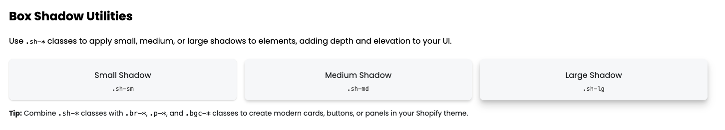
Box Shadow
PixelLayer UI provides box shadow utility classes to quickly add depth and elevation to your elements. You can apply small, medium, or large shadows without writing custom CSS. These classes are predefined and reusable.
Tips:
-
.sh-sm→ Subtle small shadow -
.sh-md→ Medium shadow for cards or panels -
.sh-lg→ Large shadow for highlighted elements -
Combine with border radius, padding, and background utilities for modern UI components
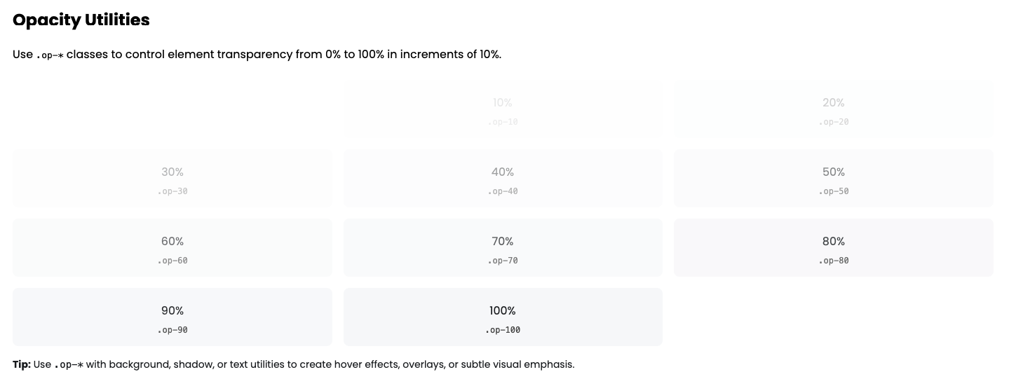
Opacity
PixelLayer UI provides opacity utility classes to control the transparency of any element. You can apply opacity in 10% increments from fully transparent to fully opaque. These classes are predefined and reusable.
Tips:
-
.op-*→ Sets element opacity -
.op-0→ Fully transparent -
.op-50→ 50% opacity -
.op-100→ Fully opaque -
Combine with background, text, and shadow utilities for visual effects
| Class | Description | Example |
|---|---|---|
.op-0 |
Fully transparent (0%) | <div class="op-0 bgc-primary w-50 h-25">Opacity 0%</div> |
.op-10 |
10% opacity | <div class="op-10 bgc-secondary w-50 h-25">Opacity 10%</div> |
.op-20 |
20% opacity | <div class="op-20 bgc-success w-50 h-25">Opacity 20%</div> |
.op-30 |
30% opacity | <div class="op-30 bgc-danger w-50 h-25">Opacity 30%</div> |
.op-40 |
40% opacity | <div class="op-40 bgc-warning w-50 h-25">Opacity 40%</div> |
.op-50 |
50% opacity | <div class="op-50 bgc-info w-50 h-25">Opacity 50%</div> |
.op-60 |
60% opacity | <div class="op-60 bgc-dark w-50 h-25">Opacity 60%</div> |
.op-70 |
70% opacity | <div class="op-70 bgc-primary w-50 h-25">Opacity 70%</div> |
.op-80 |
80% opacity | <div class="op-80 bgc-secondary w-50 h-25">Opacity 80%</div> |
.op-90 |
90% opacity | <div class="op-90 bgc-success w-50 h-25">Opacity 90%</div> |
.op-100 |
Fully opaque (100%) | <div class="op-100 bgc-danger w-50 h-25">Opacity 100%</div> |
z Index
PixelLayer UI provides z-index utility classes to control the stacking order of elements. You can bring elements forward or push them backward relative to other elements in your layout. These classes are predefined and reusable.
Tips:
-
.z-*→ Sets z-index value -
Lower numbers (0, 1) → Elements appear behind others
-
Higher numbers (500, 999, z-max) → Elements appear on top
-
Combine with position utilities (
.dt-pos-*) to make stacking effective
| Class | Description | Example |
|---|---|---|
.z-0 |
z-index 0 (back) | <div class="dt-pos-relative z-0">Z 0</div> |
.z-1 |
z-index 1 | <div class="dt-pos-relative z-1">Z 1</div> |
.z-10 |
z-index 10 | <div class="dt-pos-relative z-10">Z 10</div> |
.z-50 |
z-index 50 | <div class="dt-pos-relative z-50">Z 50</div> |
.z-100 |
z-index 100 | <div class="dt-pos-relative z-100">Z 100</div> |
.z-500 |
z-index 500 | <div class="dt-pos-relative z-500">Z 500</div> |
.z-999 |
z-index 999 | <div class="dt-pos-relative z-999">Z 999</div> |
.z-max |
z-index 9999 (top) | <div class="dt-pos-relative z-max">Z Max</div> |
Cursor
PixelLayer UI provides cursor utility classes to quickly change the mouse pointer style over any element. These classes make your UI more interactive and give users visual feedback without writing extra CSS.
Tips:
-
.cur-*→ Apply different cursor types -
.cur-pointer→ Hand pointer for clickable elements -
.cur-default→ Default arrow pointer -
.cur-move→ Indicates draggable elements -
.cur-na→ Shows element is not interactive -
.cur-text→ Indicates text selection
| Class | Description | Example |
|---|---|---|
.cur-pointer |
Pointer (hand) | <button class="cur-pointer">Pointer</button> |
.cur-default |
Default arrow | <button class="cur-default">Default</button |
.cur-move |
Move/drag cursor | <button class="cur-move">Move</button> |
.cur-na |
Not allowed | <button class="cur-na">Not Allowed</button> |
.cur-text |
Text selection | <button class="cur-text">Text</button> |
Visibility
PixelLayer UI provides visibility utility classes to control whether an element is visible or hidden on the page. These classes are useful for toggling content without removing it from the DOM.
Tips:
-
.vis-*→ Sets element visibility -
.vis-visible→ Element is fully visible -
.vis-hidden→ Element is hidden but still occupies space -
.vis-collapse→ Collapses the element (used mainly for table rows/columns) -
Combine with display, opacity, or z-index utilities for advanced UI effects
| Class | Description | Example |
|---|---|---|
.vis-visible |
Fully visible | <div class="vis-visible bgc-primary w-50 h-25">Visible</div> |
.vis-hidden |
Hidden but occupies space | <div class="vis-hidden bgc-secondary w-50 h-25">Hidden</div> |
.vis-collapse |
Collapsed (like display:none in tables) | <div class="vis-collapse bgc-success w-50 h-25">Collapse</div> |
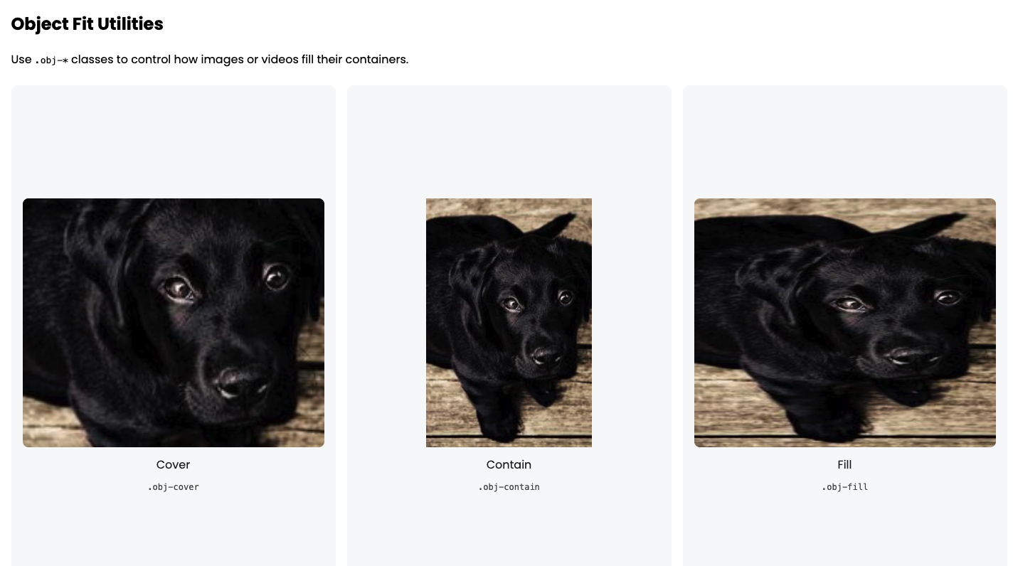
Object Fit
PixelLayer UI provides object-fit utility classes to control how images or videos fill their containers. These utilities make your media elements responsive and consistent without extra CSS.
Tips:
-
.obj-*→ Controls how media fits inside its container -
.obj-cover→ Fills container and crops overflow (best for backgrounds) -
.obj-contain→ Fits entire image inside container without cropping -
.obj-fill→ Stretches image to fill the container -
Combine with width and height utilities for responsive layouts
| Class | Description | Example |
|---|---|---|
.obj-cover |
Cover the container, cropping if needed | <img class="obj-cover w-100 h-50" src="example.jpg" alt="Cover"> |
.obj-contain |
Fit image inside container without cropping | <img class="obj-contain w-100 h-50" src="example.jpg" alt="Contain"> |
.obj-fill |
Stretch image to fill container | <img class="obj-fill w-100 h-50" src="example.jpg" alt="Fill"> |
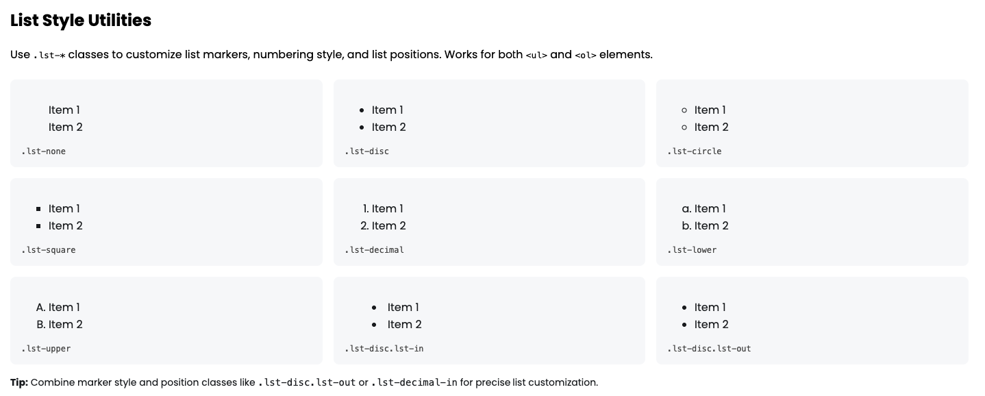
List Style
PixelLayer UI provides list style utility classes to control how lists appear. You can change bullet types, numbering styles, and list positions without writing extra CSS. These classes work for <ul> and <ol> lists.
Tips:
-
.lst-*→ Sets the bullet or number style -
.lst-none→ Removes bullets or numbers -
.lst-disc,.lst-circle,.lst-square→ Different bullet styles for unordered lists -
.lst-decimal,.lst-lower,.lst-upper→ Numbered lists with various styles -
.lst-in,.lst-out→ Adjust list item position inside or outside the container -
Combine styles like
.lst-disc-outor.lst-decimal-infor full control
| Class | Description | Example |
|---|---|---|
.lst-none |
Remove bullets or numbers | <ul class="lst-none"><li>Item 1</li><li>Item 2</li></ul> |
.lst-disc |
Disc bullets | <ul class="lst-disc"><li>Item 1</li><li>Item 2</li></ul> |
.lst-circle |
Circle bullets | <ul class="lst-circle"><li>Item 1</li><li>Item 2</li></ul> |
.lst-square |
Square bullets | <ul class="lst-square"><li>Item 1</li><li>Item 2</li></ul> |
.lst-decimal |
Decimal numbers | <ol class="lst-decimal"><li>Item 1</li><li>Item 2</li></ol> |
.lst-lower |
Lower alpha numbers | <ol class="lst-lower"><li>Item 1</li><li>Item 2</li></ol> |
.lst-upper |
Upper alpha numbers | <ol class="lst-upper"><li>Item 1</li><li>Item 2</li></ol> |
.lst-in |
List markers inside the content | <ul class="lst-disc lst-in"><li>Item 1</li><li>Item 2</li></ul> |
.lst-out |
List markers outside the content | <ul class="lst-disc lst-out"><li>Item 1</li><li>Item 2</li></ul> |
.lst-decimal-in |
Decimal numbers inside | <ol class="lst-decimal-in"><li>Item 1</li><li>Item 2</li></ol> |
.lst-disc-out |
Disc bullets outside | <ul class="lst-disc-out"><li>Item 1</li><li>Item 2</li></ul> |
Table
PixelLayer UI provides table utility classes to control layout, borders, row styles, and hover effects. Use these classes to quickly style tables in Shopify Dawn or WordPress projects without extra CSS.
Tips:
-
.tbl-*→ Controls table layout and borders -
.tbl-auto/.tbl-fixed→ Auto or fixed table layout -
.tbl-b-0/.tbl-b→ Remove or add table borders -
.tbl-collapse/.tbl-separate→ Control border collapse behavior -
.tbl-cell-b→ Add borders to individual table cells -
.tbl-strip→ Striped rows -
.tbl-hover→ Row hover effect for better interactivity
| Class | Description | Example |
|---|---|---|
.tbl-auto |
Table layout auto | <table class="tbl-auto tbl-b w-100"><tr><td>Auto</td></tr></table> |
.tbl-fixed |
Table layout fixed | <table class="tbl-fixed tbl-b w-100"><tr><td>Fixed</td></tr></table> |
.tbl-b-0 |
No table border | <table class="tbl-b-0 w-100"><tr><td>No Border</td></tr></table> |
.tbl-b |
1px table border | <table class="tbl-b w-100"><tr><td>Border</td></tr></table> |
.tbl-collapse |
Collapse table borders | <table class="tbl-collapse tbl-b w-100"><tr><td>Collapse</td></tr></table> |
.tbl-separate |
Separate table borders | <table class="tbl-separate tbl-b w-100"><tr><td>Separate</td></tr></table> |
.tbl-cell-b |
Borders on individual cells | <table class="tbl-cell-b w-100"><tr><td>Cell Border</td></tr></table> |
.tbl-strip |
Striped rows | <table class="tbl-strip tbl-b w-100"><tr><td>Striped Row</td></tr></table> |
.tbl-hover |
Row hover effect | <table class="tbl-hover tbl-b w-100"><tr><td>Hover Row</td></tr></table> |
Privacy Policy
Effective Date: [31st March 2026]
PixelLayer (“we”, “our”, “us”) respects your privacy. This Privacy Policy explains how we collect, use, and protect information when you use our Shopify app.
1. Information We Collect
- Shop Information: Store name, domain, and basic shop data required to run the app.
- Customization Data: Theme color settings, layout preferences, and container/padding adjustments.
- Usage Data: App usage metrics to improve functionality.
2. How We Use Information
- To provide and maintain the app’s functionality.
- To save your theme and layout settings.
- To communicate important updates or issues with the app.
3. Data Sharing
- We do not sell or share your personal information with third parties, except as required by law or Shopify platform needs.
4. Data Security
- We implement reasonable measures to protect your data from unauthorized access, alteration, or loss.
5. Your Choices
- You can delete your app data by uninstalling the app from your Shopify store.
- Contact us at [support email] for data removal requests.
6. Changes to This Policy
- We may update this Privacy Policy occasionally. We encourage you to review it periodically.
Contact Us
- Email: info@dharapixel.com
- Website: dharapixel.com